Search This Blog

Monday 15 September 2014

This is the Evaluation which I worked for the previous work which I've done in media. 


---------->  Open carefully <----------

Monday 8 September 2014

Awesome 5x5


Films 
The Expendables III
Blue Streak
The Born Supremacy
Let's be cops
Gone in 60 Seconds


Computer Games
Sims 3
Tricky truck
Arma II
Garry's Mod
APB Reloded


TV 
Criminal Minds
Storage Hunters
Big Bang Theory
NCIS
Top Gear


Music
Milky Chance
One Republic
Fall Out Boy
Imagine Dragons
Lucy Spraggan


Art
Henri Matisse
Pablo Picasso
Lucian Freud
Richard Hamilton
Andy Warhol


Tuesday 2 September 2014

Magazine Project

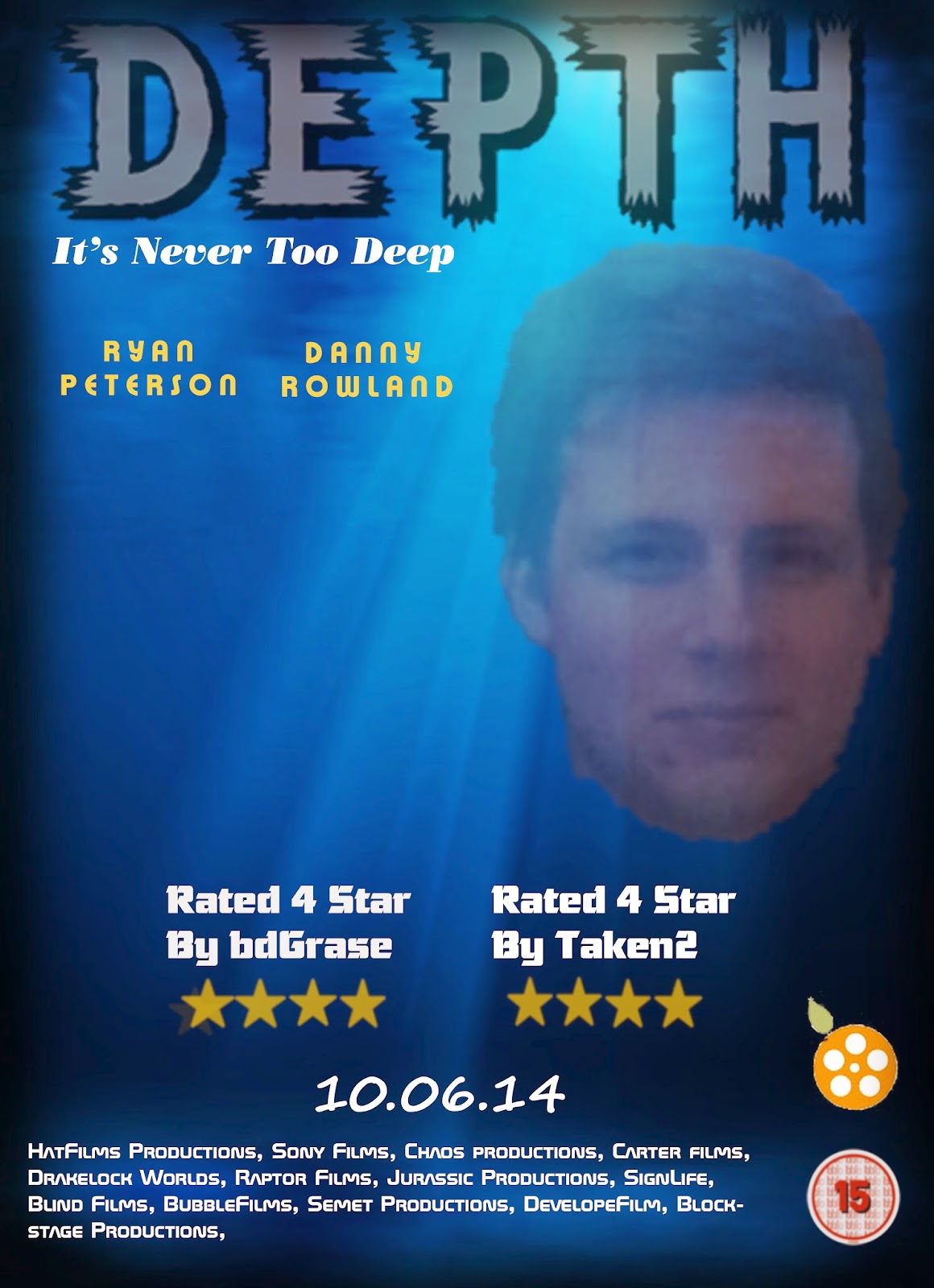
In year 10 I was asked to create a magazine front cover, contents page and a double page spread. In the end I think that the 3 pieces of work which I produced was up to a high standard especially on the contents page as it looks really professional as if it was from a really magazine.

For the all of the pieces I looked at the templates and of film magazines such as; Empire, Total Film. And I learnt from this that my audience really likes the look of dark colours as it shows danger towards the audience making them want to buy it as they like there. 

Ways to improve is to research a lot about the audience which I'm aiming my magazine at so I know what I could have done to create a magazine which would grab there attention really well. In addition to that I would tried to use the same colours as over all 3 of the pieces I used a mixture of different colour schemes and it doesn't looks good as they all look like separate pieces from different magazines which means that it's not going to be attractive to the target audience.


Monday 1 September 2014

Film Poster Project

This is one of the projects which I covered in Media Studies in year 10. I was asked by my teacher to create a action/fantasy magazine after watching to films (The Amazing Spiderman & The Hunger Games) and by looking at how they advertise the films

When making this film poster I found it really difficult to make it while constantly thinking of the audience that I was trying to aim it at. But overall I was fairly happy with the end product which I came out with as it has most of the conventions that film posters use.

There are a couple of suggestions which I could think of to improve the product, such as; improving the character image on the front cover. I also think I could have made it appeal to a female audience by adding the codes and conventions that a females would appeal to.